If you have a website or an app, you probably know the importance of optimizing them to increase the click or conversion rate. CRO (Conversion Rate Optimization) is a set of practices that you can try to improve your business numbers- and A/B tests are the simplest and most effective practice you can carry out. Today, we give you some ideas to get you started in A/B testing, both for webs and apps.
Gathering ideas from an A/B test is not always easy. If you want to get good results, you must consider the type of business, the audience, the seasonality and many other factors. However, there are also common features and, therefore, generic A/B tests you can run.
A/B Test Ideas For a Website
An A/B Test is more likely to run if the changes we apply arise as an answer to a defined hypothesis after having analyzed our data in detail, or rather, after having done a conversion research.
Whether it is a new project or one in which you have been working for a long time, it is possible that after analyzing all the information you feel stuck and cannot think of what else you can optimize. If this is your case, here you have some ideas to perform an A/B Test:
1. CTA Placement
Logic tells us that it makes more sense to explain a product first completely, and then to place the contact form or purchase process. However, the user may not reach this point due to a lack of time or interest.
We can start by trying to include several CTAs among the different elements of the content, in order to prevent our contact form or purchase process from being buried under several scrolls. If we are trying to optimize the conversion on our website, it is important to give visibility to the element of our website through which that conversion is achieved.
Our learning:
- In sites with a lot of content, such as blogs, including the CTA as a sticky element in the margin so it remains visible while the user scrolls, usually works quite well.
- This possibility does not exist for mobile versions, so a good solution is to include a small sticky menu at the bottom of the screen or on the right side.

2. The CTA texts
First, in the text of a button, we should show what users will achieve by clicking on that button. However, depending on the product, the user profile, the point in the purchase process or the rest of the content where the CTA is framed, we may get more conversions with a CTA or another.
Obviously, when setting this test, we should prioritize which is the main conversion we want to optimize. If we don’t increase sales, there is no use in getting more clicks on the detail page of a product. If we can’t increase conversions, there’s no point in getting a lot of calls in a call center.
Our learning:
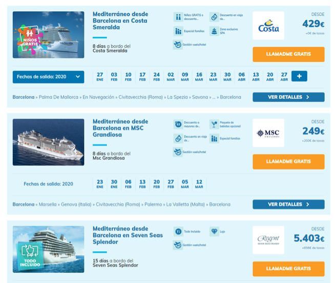
- “We call you for free”, “Receive a call”, “Talk to an expert” are usually C2C classics. They normally work well, but they are not always the best option.
- “Find out more”, “Learn more”, “I’m Interested” fit when the user will receive more product information, either on the web or by phone.
- When using “Buy now” in a C2C there may be fewer calls, but more aimed to close the contract.
- Something more original, such as “I’m coming” or “Get on bord” on a travel website, must be tested, but it is more difficult to work.
- “Request pricing” or “See our prices” are characteristic of more complicated products, such as insurance, where the final price will depend on different conditions.
3. Product listing or results
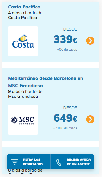
Sometimes the user finds so many options available that it is so hard to choose. If you believe that this may be what is happening on your website, it is good to consider trying to include some element or a way to organize the information that helps the user to take a decision.
Our learning:
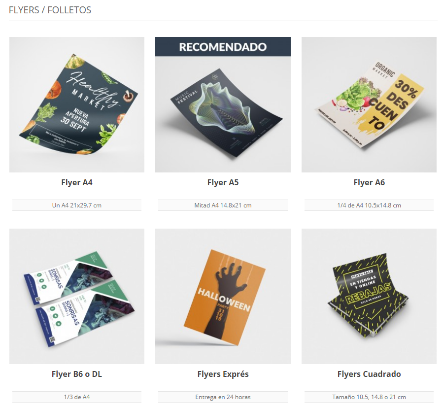
- To include tags like “Recommended”, “Best seller”, “Free shipping” usually works well when it comes to an eCommerce. If Amazon does it, why don’t you?

- Indicating if it is a “Limited time offer” or if only the “Last places” remain, generates some urgency in the user, so it is encouraged that the contract or purchase should be closed beforehand.
- Sometimes it works well including badges that allow the user to quickly visualize the product value. Some examples: “All inclusive”, “Children free”, “Free enrollment”, “No minimum contract period” are advantages that can be highly valued by some users.

4. “User’s guide”… yes or no?
We will always have the doubt… Will be the purchase process be clear enough? Will the user understand what to do to get what we offer? Should we explain the steps to follow? A website should be intuitive enough for the user to get where they want to without needing further explanations. However, sometimes certain explanation it is necessary. Always, when in doubt,, try it with an A/B test.
Our learning:
- If it is a product apparently complicated to order, it is good to briefly highlight at the beginning the steps that the user must follow to complete the process.
- In a purchase process or configuration of a product, it usually works to include a progress bar that lets the user know what step they are in, and which steps are still ahead.
5. Pricing
Should we show the price from the beginning? Or better we leave it to the end? Depending on the type of product and the experiences the user has had, it may be better to go ahead with the price, or, on the contrary, not showing it before having the opportunity to demonstrate the value or advantages of the product to the user.

Our learning:
- If the price is the main hook of your product, of course, show it!
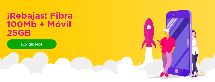
- In some websites, including a final offer increases the user’s interest in it, so they decide to take an action, such as calling or continuing with the purchase process.
- If at the time of the purchase process in which the user is, you cannot justify a high price providing value, it is better not to show the price yet.
A/B Test Ideas For Apps Of Any Sector In Play Store
Optimizing your app at the Play Store can make a difference. Ana Vilar offers us the following A / B tests. Try them, and see it for yourself!
6. Emojis vs. no emojis
When used in the short description area, emojis can increase your app downloads or the complete opposite. Everyone loves emojis! Do we? Or do they rather feel spammy? Depending on the age of your audience, the country or the app sector, you can discover interesting facts if you run an A/B test. Do a first test on the short description with and without emojis. If it works, try different emojis!
Our learning:
- An emoji in the short description works best in countries like the United States, France, Mexico, Italy… And many more! But not usually in Spain.
- If the age of your audience is between 18 and 30, it is likely to work. For audiences +30, they can lower your conversion.
- Some sectors are more likely to have a successful emoji: for example, a hamburger in a recipe app or a plane in a travel app.
7. The first paragraph of the long description
Often, the first lines in the app descriptions are the only ones to be read. To be as effective as possible, try different styles. You can play with the length, with phrases between exclamation points, with questions, include a slogan… Anything you can think of!
Our learning:
- Less is more: it is important that the first paragraph is brief and concise
- Evoke emotions: a good copy, evoking and motivating is usually the best option
- Text only: in our experience, cramming this area with emojis or rich formatting does not help.
8. The icon
To make your app stand out from the crowd, try different icon models. You can change the color, use letters instead of an object, add a gradient, etc. Prepare a handful of different versions and see for yourself which one works best.

Our learning:
- To stand excessively out of the prevalent colors may move the user away instead of drawing their attention.
- Gradient colors caused a furor when Instagram changed its logo back in 2016. Now it don’t usually work very well. Tastes change!
- If you want to represent a human in your logo (in a sports app, for example), better for it to be in profile and looking to the right.
9. Screenshots
The screenshots of your app should be especially well taken care of, since they not only capture the attention of those who see them, but also explain in detail the features of the app.
In this case, the ideas are many: you can change the order, the background colors and the typography, include a text or not, try different texts, include the phone frame or not… Get inspired with the most important accounts and don’t stop trying!
Our learning:
- Better with frame: screenshots seem work better if they are framed on a phone. You can try different models, colors or sizes.
- With a small text: it is not infallible, but adding a brief explanation in each image can help, provided that the main attention remains on the image on the phone.
10. Rich Formatting
Since rich formatting came into our lives, the way of doing ASO in apps has changed a lot. In most cases, it has been proven that using bold, underlined o colors works better than good. The reading of the file is much more bearable, corporate colors promote the image brand and therefore the downloads tend to raise like foam.
Our learning:
- Highlighting titles, features of the app or benefits to users is the most efficient option. This helps the UX and quickly transmits what the app can do for the user.
- Less is more: no abusing of colors and bold is key so we do not overwhelm users.
These would be some ideas to start trying some changes in your website or app. If you already have your A/B test running, we give you the keys to know when to stop an A/B test. Do not hesitate to leave us your comments, what has worked for you?
