Have you ever wondered why some songs sound louder than others? Why does the artist seem to be trying to burst our eardrums? I knew I was not the only one! The answer to this great dilemma for humanity was -apparently-given by some producers and sound engineers, who warned that a phenomenon was taking place in record companies: Loudness War.
This phenomenon occurred both during the recording of new albums and during their remastering: the volume of the songs was progressively increasing, causing them to lose quality and definition. Here you can have more information related with the technical details an reasons why this Loudness War happens. In this post we will focus on something else: data extraction and hypothesis validation.
As much as I liked this theory and believed these experts (that had little to gain by saying such things), I had to bear in mind that it was their word against that of the record labels. As a good analyst, I needed to have proof to understand whether this was really happening or not. I needed to validate this hypothesis. So I started a research to find where I could get this type of information for a relatively large sample of songs. Eventually, it could not be otherwise: I ended at Spotify.
For someone who enjoys data and music at the same level, the Spotify API is like stepping into paradise. The amount of information that you can extract from there is practically infinite, and very diverse.
To obtain the information I needed for my analysis, I had to do it in two different stages:
- Collect a metadata base of songs (name, artist, album, id …), large enough to be considered a sample.
- Extract the information of some features (loudness, danceability, energy …) in relation to those songs.
Data Extraction from the Spotify API
Let me take a brief walk on the wild side of the code used to extract this data, so you can better understand this process:
Calling the Spotify API
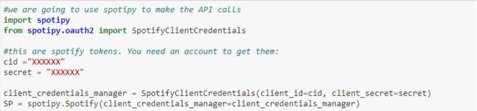
First of all, we have to call the Spotify API using the spotipy module. We will need a developer account on Spotify in order to be able to make these calls, but it is a super easy step. This way we can get the Client Id and Client Secret that we will store as a variable, to use later.
Create a list of songs by decades
My intention was to collect songs from different decades, in order to study the evolution of this trend. To do this, now we must create a list with the years that make up those decades (this is the format that Spotify understands as a decade). As you can see, what the make_track function does is create the structure that I want to obtain as a song database. This will help us in the next step.
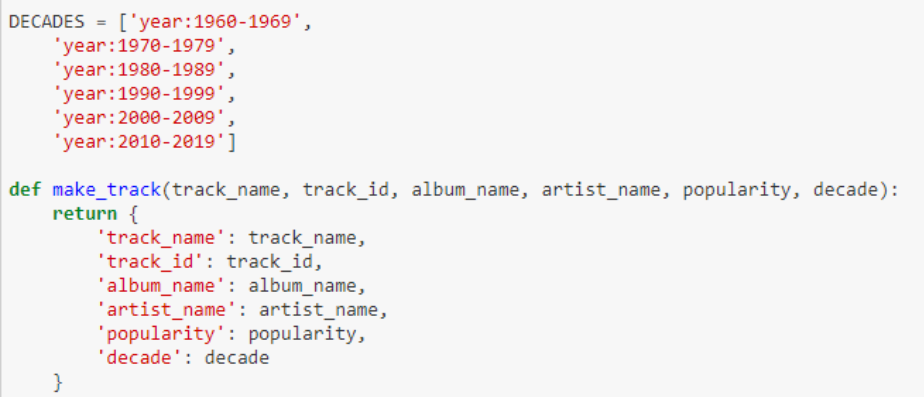
*Tip: to have everything more organized what we will do is to link the corresponding decade to each song. The function get_first_year will help us.
Obtaining data
The get_tracks function is where magic happens: the creation of the call to Spotify. We will finally use this function in a loop so that it returns us the data we wanted.
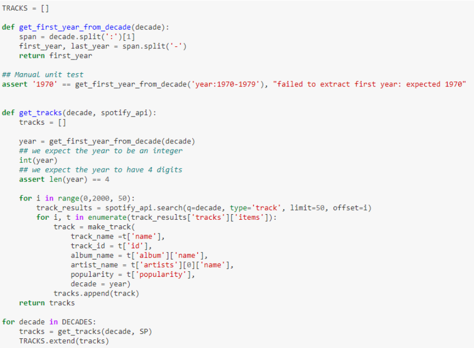
We already have our database with the metadata of about 12,000 songs (2,000 per decade). Now is when the party begins: it’s time to store this data and call Spotify again to collect the features by ID. We will get something like this:
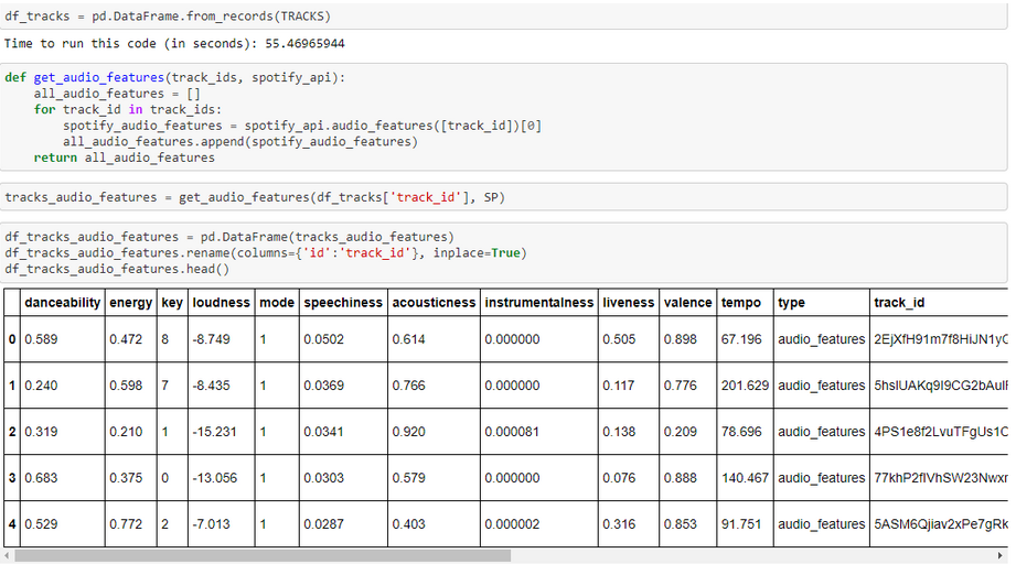
What we find here are all those characteristics associated to a song (in this case, to an ID), that we will use later on for our analysis.
Creation of our data base
Now we just have to join the previous dataframe created. This will allow us to have both the information of the artist or the decade of the song, as well as the characteristics that we are going to explore. When we have this data, what we will do is to create a CSV file that we will use to work on our data visualization platform: in this case, Data Studio.
Data visualization using Google Data Studio
Google Data Studio is a tool that I really like for two main reasons: it’s free and it allows you a relatively great flexibility to do the things you want.
Here you can see the final result of this experiment, in which I have even prepared a small interactive mode for everyone to search for their favorite artists or songs. But stay here before you start playing with it because now it’s time for the most important part of this whole post: how to correctly represent the data we have extracted.
Why is this the most important part? Because it is here where people may understand what you are trying to transmit. And magnificent data, when it is poorly transmitted, is of little use. My idea here was to try to simplify graphics as much as possible to make the understanding of essentially specialized information easier. To do this, I used 3 graphs to clearly show if the initial hypothesis was right or wrong.
Let’s start with the first one, the histogram:
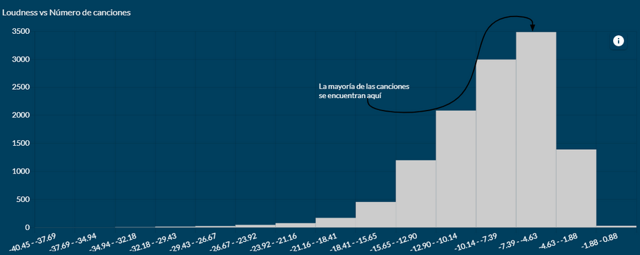
This is already giving us a lot of information. The distribution of the sample is mainly in those higher sections, that is, with a greater volume. It seems that the conspiracy theory is taking hold. Let’s see if they are also correct in the temporal evolution, since all this seems to start with the insertion of the CD in the market:
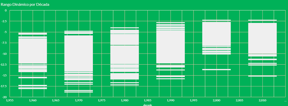
According to the graph, it seems that from the 60s to the 80s the dynamic range of the songs was progressively widening, but from the 90s on we see how the volume increases and the dynamic range decreases, being the 2000s the worst point of this series.
Conclusion: The Battle of Volume is real
What does this mean exactly? Well, it means that Wikipedia, as always, was right. Critics of volume in music have their arguments very well covered here, because as we have verified, music has undergone a process of ‘volumeization’ in recent decades. And this has made it lose much of its dynamic range and therefore, of its emotional range.
Let’s see some examples that clearly represent this process:
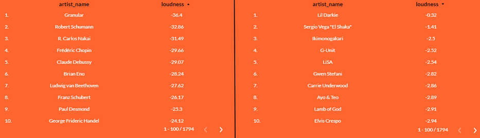
The vast majority of artists with the lowest volume (on our left) belong to the classical music area. No surprises here. But if we move to the spectrum with higher volume, we begin to perceive strange things. For example, we find that Gwen Stefani has a higher volume than Lamb of God. SOAD has practically the same volume as Rosalía or Calvin Harris. Even Sean Paul is louder than the Sex Pistols!
And here we conclude our analysis, since little more can be added. The fact that certain music that should not be conceptually ‘loud’ has these volume levels only reinforces the fact that there has been (and still is, though at a lower level) an escalation on the sonic elevation of songs. It could be compared with the decibels reached by those big metal industries during the Industrial Revolution era.
And, if you don’t believe me, get the data and check it.